Plotting
Color handling with DataLevels
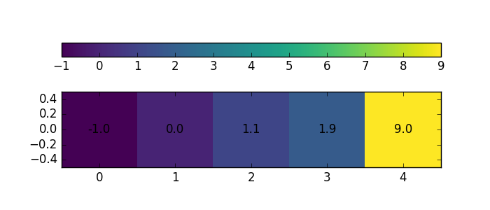
DataLevels is the base class for handling colors. It is there to
ensure that there will never be a mismatch between data and assigned colors.
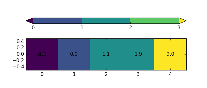
In [1]: from salem import DataLevels

In [2]: a = [-1., 0., 1.1, 1.9, 9.]

In [3]: dl = DataLevels(a)

In [4]: dl.visualize(orientation='horizontal', add_values=True)
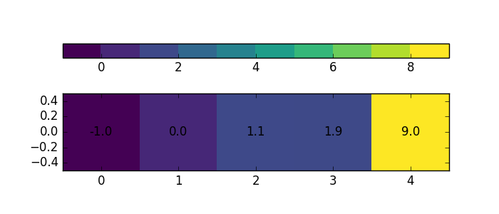
Discrete levels
In [5]: dl.set_plot_params(nlevels=11)

In [6]: dl.visualize(orientation='horizontal', add_values=True)
vmin, vmax
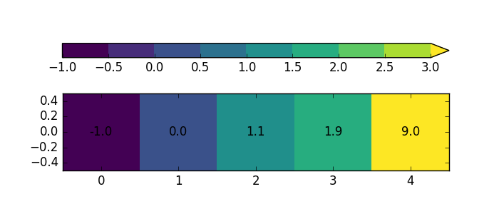
In [7]: dl.set_plot_params(nlevels=9, vmax=3)

In [8]: dl.visualize(orientation='horizontal', add_values=True)
Out-of-bounds data
In [9]: dl.set_plot_params(levels=[0, 1, 2, 3])

In [10]: dl.visualize(orientation='horizontal', add_values=True)
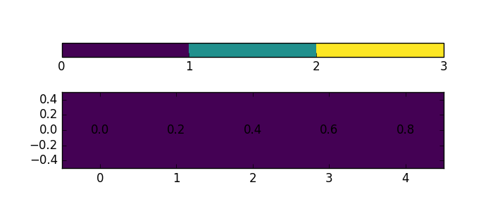
Note that if the bounds are not exceeded, the colorbar extensions are gone:
In [11]: dl.set_data([0., 0.2, 0.4, 0.6, 0.8])

In [12]: dl.visualize(orientation='horizontal', add_values=True)
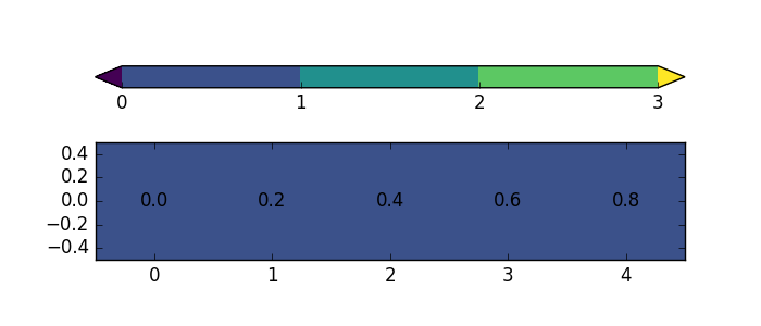
This might be undesirable, so you can set a keyword to force out-of-bounds levels:
In [13]: dl.set_plot_params(levels=[0, 1, 2, 3], extend='both')

In [14]: dl.visualize(orientation='horizontal', add_values=True)
Using DataLevels with matplotlib
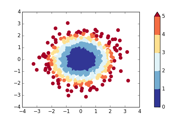
Here with the example of a scatterplot:
In [15]: x, y = np.random.randn(1000), np.random.randn(1000)

In [16]: z = x**2 + y**2

In [17]: dl = DataLevels(z, cmap='RdYlBu_r', levels=np.arange(6))

In [18]: fig, ax = plt.subplots(1, figsize=(6, 4))

In [19]: ax.scatter(x, y, color=dl.to_rgb(), s=64);

In [20]: cbar = dl.append_colorbar(ax, "right")  # DataLevel draws the colorbar

In [21]: plt.show()
Maps
Map is a sublass of DataLevels, but adds the
georeferencing aspects to the plot. A Map is initalised with a
Grid:
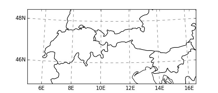
In [22]: from salem import mercator_grid, Map, get_demo_file, open_xr_dataset

In [23]: grid = mercator_grid(center_ll=(10.76, 46.79), extent=(9e5, 4e5))

In [24]: emap = Map(grid)

In [25]: emap.visualize(addcbar=False)
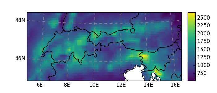
The map image has it’s own pixel resolution (set with the keywords nx or
ny), and the cartographic information is simply overlayed on it. When asked
to plot data, the map will automatically transform it to the map projection:
In [26]: ds = open_xr_dataset(get_demo_file('histalp_avg_1961-1990.nc'))

In [27]: emap.set_data(ds.prcp)

In [28]: emap.visualize()
Add topographical shading to a map
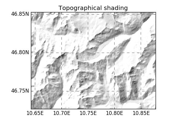
You can add topographical shading to a map with DEM files:
In [29]: grid = mercator_grid(center_ll=(10.76, 46.79), extent=(18000, 14000))

In [30]: smap = Map(grid, countries=False)

In [31]: smap.set_topography(get_demo_file('hef_srtm.tif'));

In [32]: smap.visualize(addcbar=False, title='Topographical shading')
Note that you can also use the topography data to make a colourful plot:
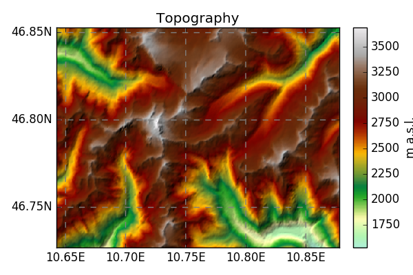
In [33]: z = smap.set_topography(get_demo_file('hef_srtm.tif'))

In [34]: smap.set_data(z)

In [35]: smap.set_cmap('topo')

In [36]: smap.visualize(title='Topography', cbar_title='m a.s.l.')