Graphics
Two options are offered to you when plotting geolocalised data on maps:
you can use cartopy , or you can use salem’s Map object.
Plotting with cartopy
Plotting on maps using xarray and cartopy is extremely convenient.
With salem you can keep your usual plotting workflow, even with more exotic map projections:
In [1]: import matplotlib.pyplot as plt
In [2]: import cartopy
In [3]: from salem import open_wrf_dataset, get_demo_file
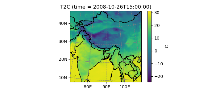
In [4]: ds = open_wrf_dataset(get_demo_file('wrfout_d01.nc'))
In [5]: ax = plt.axes(projection=cartopy.crs.Orthographic(70, 30))
In [6]: ax.set_global();
In [7]: ds.T2C.isel(time=1).plot.contourf(ax=ax, transform=ds.salem.cartopy());
In [8]: ax.coastlines();

You can also use the salem accessor to initialise the plot’s map projection:
In [9]: proj = ds.salem.cartopy()

In [10]: ax = plt.axes(projection=proj)

In [11]: ax.coastlines();

In [12]: ax.add_feature(cartopy.feature.BORDERS, linestyle=':');

In [13]: ax.set_extent(ds.salem.grid.extent, crs=proj);
Plotting with salem
Salem comes with a homegrown plotting tool. It is less flexible than cartopy, but it was created to overcome some of cartopy’s limitations (e.g. the impossibility to add tick labels to lambert conformal maps), and to make nice looking regional maps:
In [14]: ds.T2C.isel(time=1).salem.quick_map()
Out[14]: <salem.graphics.Map at 0x7f2bf8ff2290>
Salem maps are different from cartopy’s in that they don’t change the matplotlib axes’ projection. The map background is always going to be a call to imshow(), with an image size decided at instanciation:
In [15]: from salem import mercator_grid, Map, open_xr_dataset

In [16]: grid = mercator_grid(center_ll=(10.76, 46.79), extent=(9e5, 4e5))

In [17]: grid.nx, grid.ny  # size of the input grid
Out[17]: (1350, 600)

In [18]: smap = Map(grid, nx=500)

In [19]: smap.grid.nx, smap.grid.ny  # size of the "image", and thus of the axes
Out[19]: (500, 222)

In [20]: smap.visualize(addcbar=False)
Out[20]:
{'imshow': <matplotlib.image.AxesImage at 0x7f2bf8cb5dd0>,
 'contour': [],
 'contourf': []}
The map has it’s own grid, wich is used internally in order to transform the data that has to be plotted on it:
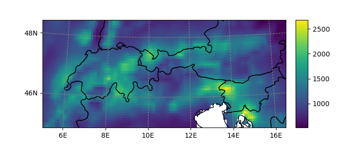
In [21]: ds = open_xr_dataset(get_demo_file('histalp_avg_1961-1990.nc'))

In [22]: smap.set_data(ds.prcp)  # histalp is a lon/lat dataset

In [23]: smap.visualize()
Out[23]:
{'imshow': <matplotlib.image.AxesImage at 0x7f2bf3acd250>,
 'contour': [],
 'contourf': []}
Refer to Recipes for more examples on how to use salem’s maps.